Evans’ image of River Hill Cafe has a lot to unpack. Firstly, the image being black-and-white denotes that it was taken during a time period when color photography was not accessible. Therefore, the audience must look at this image through a historical lens. Another element of art that is significant to this image is space. The door of the diner seems to be the focal point of the image; however, there are other distinguishable items. Some include the bicycle and the signs on the post. Nonetheless, they seem to blend in with the rest of the image because of their distance from the door. The diner spreads across the entire image. This tells the audience that as an entity, this restaurant consumes a lot of spacial area.
Three Principles of Design that are utilized in this image include emphasis, proportion, and balance. As noted before, there is great emphasis placed on the door. The door contrasts immensely with the rest of the image. Even though it is very dark, it definitely has a mysterious, yet inviting quality to it. Also, there is a lot of emphasis placed on the sign, especially the Coca Cola portion of it. Next, the proportion of items is very relevant to this image. The bigger the items, the larger the emphasis that is placed on them. For example, the bicycle and the signs are irrelevant features to the purpose of this picture. If they were removed, one could still discern that this image is meant to portray a cafe. Lastly, the photograph has a balancing quality to it. For instance, each side of the diner has a sign on it. The balance is underscored by the post separating both sides of the diner. It’s almost as if the post is bisecting the diner into two equal halves.
I think the meaning behind this photograph is very clear: Evans was illustrating how capitalism was overrunning society during this time. Why is a seemingly normal cafe marketing Coca Cola to its customers? A cafe has much more to offer than a beverage. This is especially different from the signs we see today for cafes. It showcases how much these big corporations were trying to monopolize smaller businesses.
Using “The Art of Seeing Art’s” language shifted my perspective of the image. At first, this was merely just a photograph of a cafe to me. However, the more I used the different forms of analysis, I soon had a better grasp of what the image was trying to share. I think this is shown in my analysis. At first, I was critiquing the physical features. As a dug deeper, I soon realized that the image was offering much more than meets the eye. I first found this image appealing because of how simplistic it seemed. Nonetheless, I learned that there were many more layers to it than just its picturesque quality.
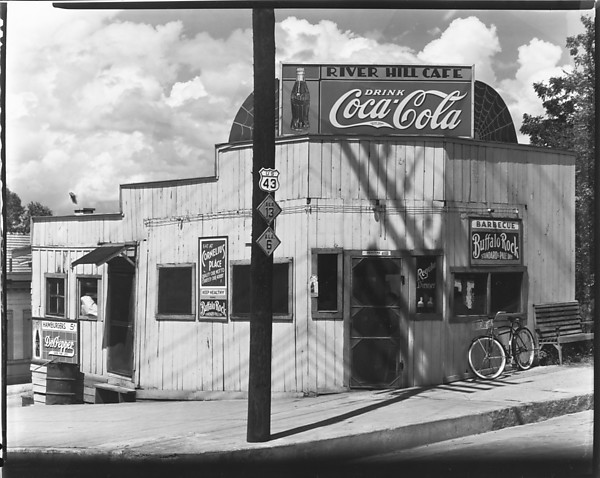
Walker Evans’ image
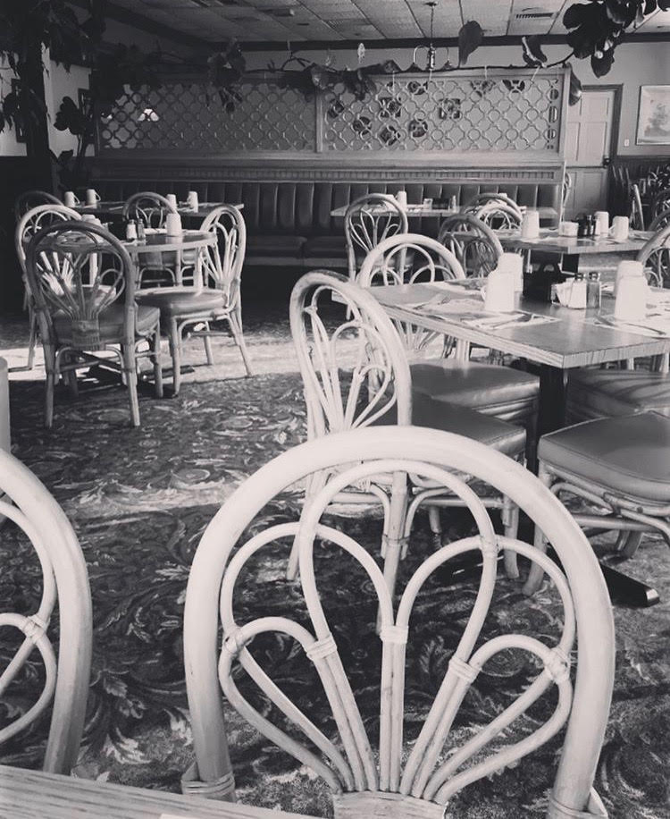
My Homage to Evans
